Liverpool Innovation & Impact Awards
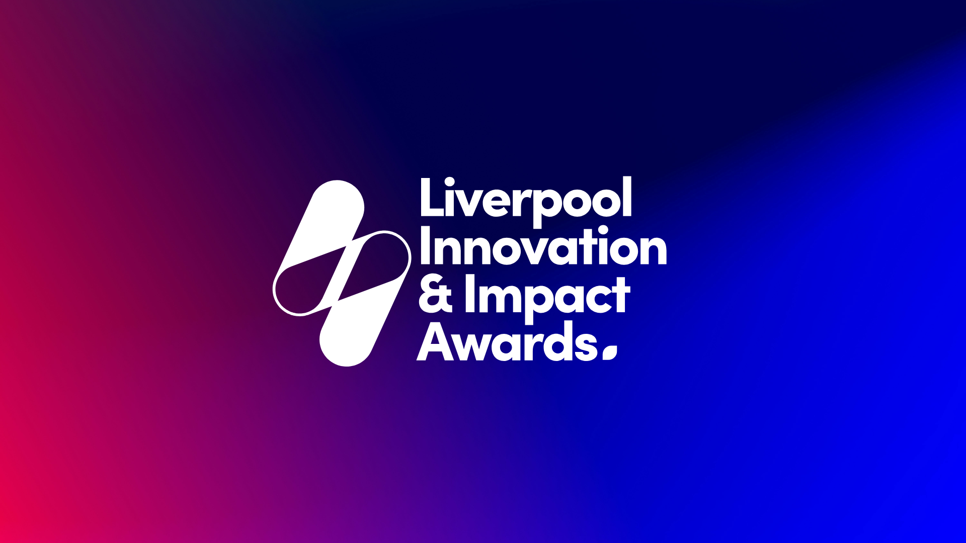
The Liverpool Innovation & Impact Awards were conceived as a new platform to recognise and celebrate organisations, businesses, and individuals driving meaningful change across the Liverpool City Region presented by Liverpool Chamber of Commerce.
This isn’t just another awards programme.
It needed to feel different from the outset.
More open. More inclusive. More reflective of a region where identity, pride, and perspective all play a role in how impact is understood.
GoodShip* was brought in to create the brand, visual system, and digital launch experience.
The challenge was clear:
- Create something iconic, immediately recognisable
- Avoid cultural tension, particularly around football affiliations
- Build a system that could grow year-on-year
- Deliver everything within a 10-day sprint to launch
The Challenge
Liverpool is a city with strong signals.
Visual identity here is never neutral by default. Colours, symbols, and references can quickly become associated with one side or another.
Designing for the region meant navigating that reality carefully.
The identity needed to:
- Belong to everyone, not one audience
- Feel rooted in place, without leaning on clichés
- Work across venues, including Hill Dickinson Stadium and Anfield
- Carry enough weight to feel established from day one
At the same time, it needed to avoid the trap of over-design.
Because impact, in this context, isn’t one thing. It’s many things, defined differently by each organisation involved.
The Approach
Starting with simplicity
Rather than layering complexity, the team stripped everything back.
Looking at cultural references like Cream Nightclub, the insight was clear:
the most enduring identities don’t explain themselves, they invite interpretation.
This became the foundation.
Creating a mark that invites meaning
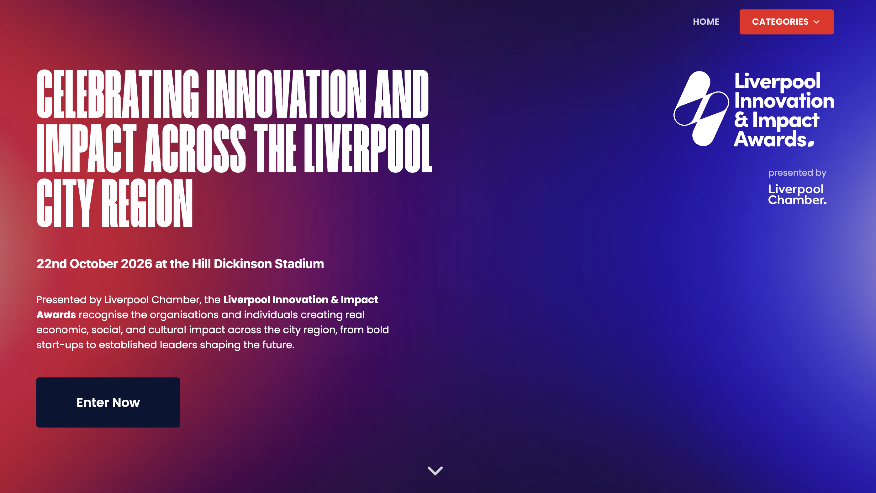
At the centre of the identity sits the “II” lightning bolt symbol.
A deliberately ambiguous mark that can be read in multiple ways:
- Innovation & Impact (II)
- Energy, momentum, change
- A visual disruption, something that cuts through
Importantly, it doesn’t land on a single meaning.
That ambiguity was intentional.
Because the awards themselves are about recognising different forms of impact, the identity needed to reflect that openness rather than define it too tightly.

Designing a system, not just a logo
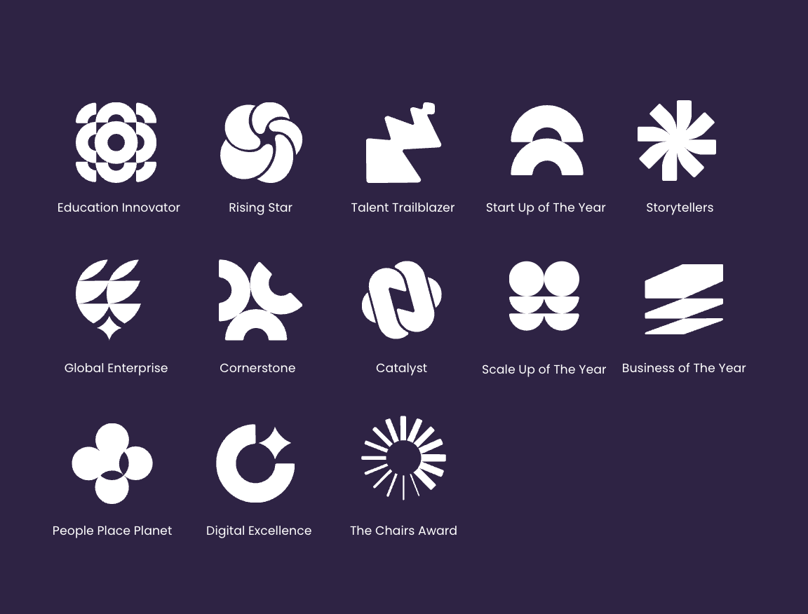
From the core symbol, the identity expanded into a full visual system.
Each award category was given its own:
- Custom geometric icon
- Distinct gradient palette
- Consistent structural logic
This allowed the brand to scale immediately.
Instead of a single mark doing all the work, the system created space for multiple stories to exist within one coherent identity.
Rooted in Liverpool, without being defined by it
A secondary layer of iconography introduced the city itself.
Simplified, monotone representations of key landmarks across the Liverpool City Region were developed:
- Clean
- Rounded
- Consistent with the wider system
These weren’t designed to dominate the identity.
Instead, they act as subtle signals of place, reinforcing that this is a story about Liverpool, told through the people and organisations shaping it.

Digital Experience
Alongside the visual identity, Goodship delivered a microsite designed to:
- Enable nominations and applications across all categories
- Simplify what is often a complex process
- Carry the same clarity and visual consistency as the brand
The focus was on reducing friction.
Making it easy for organisations, regardless of size or resource, to take part.
View the Liverpool Innovation & Impact Awards website by clicking here or via visiting liverpoolawards.com
Delivery
The entire project, from concept to live launch, was delivered in just 10 days.
A tightly coordinated sprint involving:
- Gavin Sherratt
- Shawla Ahad
- John Whalley
- Abubakr Abdulraheem
This compressed timeline required:
- Rapid decision-making
- Clear creative direction
- Continuous collaboration across design and development
It’s an example of how Goodship operates when speed matters, translating strategy into live outputs without losing clarity.
The Outcome
The Liverpool Innovation & Impact Awards launched with:
- A distinctive, ownable visual identity
- A scalable system ready for future years
- A digital platform enabling immediate participation
- A brand that belongs to the region, not a single institution
More importantly, it created a framework where impact isn’t prescribed.
It’s defined by those contributing to it.

The Takeaway
This project demonstrates that strong identity doesn’t always come from adding more.
Sometimes it comes from removing noise, creating space, and allowing meaning to emerge.
By focusing on simplicity, interpretation, and system design, Goodship delivered a brand that can grow with the awards, and with the city itself.
Visit liverpoolawards.com to learning more about the Liverpool Innovation & Impact Awards.