From Concept to Impact: Designing the Liverpool Innovation and Impact Awards Visual Identity
A story of collaboration, culture, and creativity, crafting a distinctive visual identity for the Liverpool Innovation and Impact Awards.
We get by with a little help from our friends. That idea sat at the centre of this project from day one.
The work we delivered for the Liverpool Chamber of Commerce and the Liverpool Innovation & Impact Awards was never just about creating a visual identity. It was about building something that reflects the energy, diversity and ambition of the Liverpool City Region, and doing it in a way that genuinely embodied collaboration.
The timeline made that intent even sharper. Ten days. A tight sprint. No room for overthinking, only space for clarity, trust and decisive creative thinking.
That is where the collaboration with Shawla Ahad and John Whalley came into its own.
We already had a shared understanding of how each other works, which meant we could move quickly without losing depth. Working remotely, we stayed closely connected through regular conversations, sharing work in progress, challenging ideas, and refining direction in real time. It never felt fragmented. It felt focused.
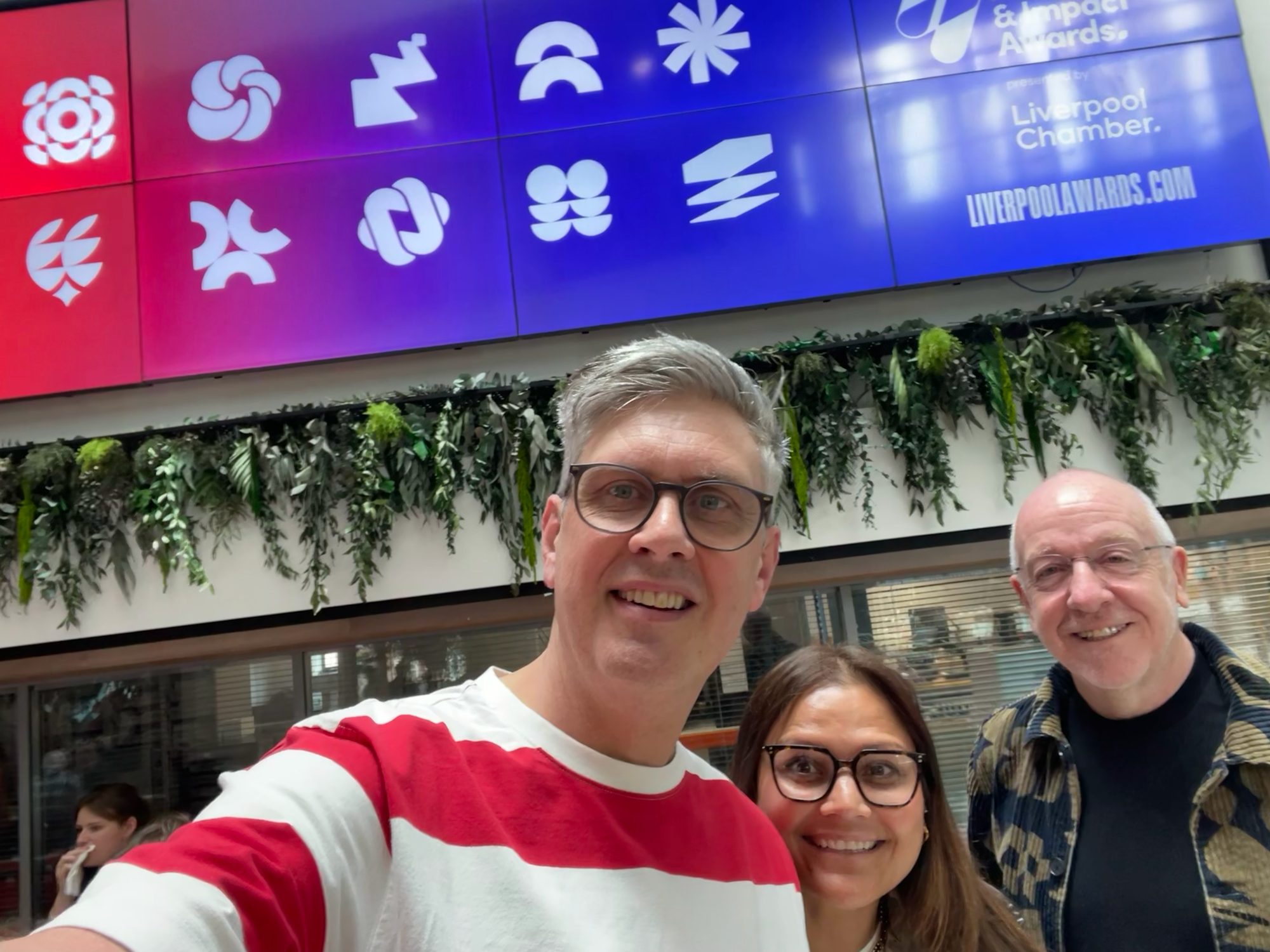
Each of us brought something different into the process. Different references, different instincts, different ways of shaping an idea. The strength came from how those perspectives combined, not competed. We were building something together, not dividing up tasks.
The creative direction itself was rooted in Liverpool. Not in an obvious or nostalgic way, but in a way that draws from the city’s design heritage and cultural signals. Influences like Mark Farrow and the iconic Cream nightclub identity helped shape an approach that feels both recognisable and contemporary.
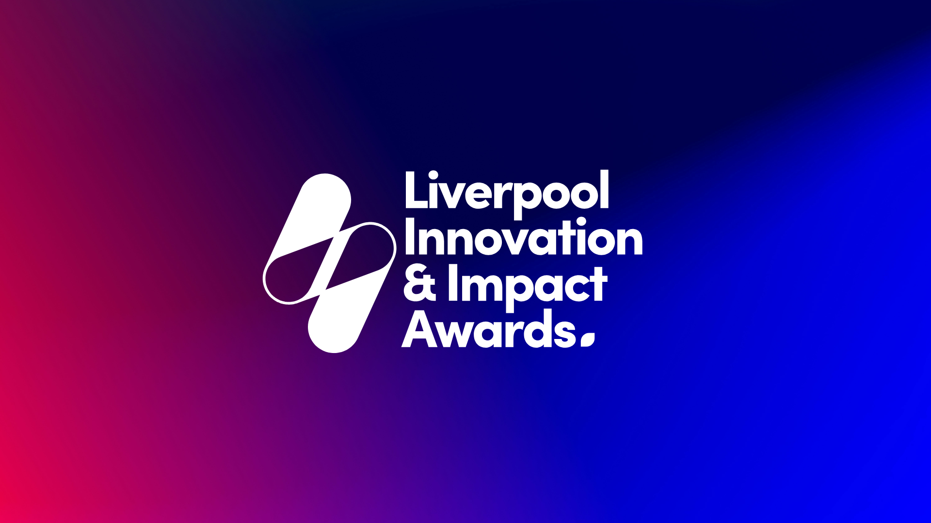
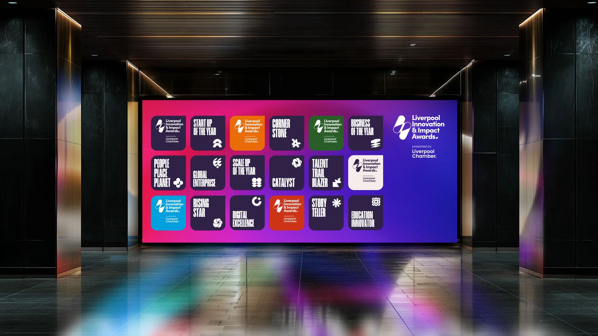
From there, we developed a visual language that balances simplicity with meaning. Softer, rounded edges introduced a more human quality, moving away from the rigidity often associated with corporate or institutional design. Liverpool’s iconography was subtly embedded, not as decoration, but as a layer of identity.
One of the defining ideas became what we described as the “power of the eyes (i i)”, a way of expressing awareness, vision and impact. It created a flexible system that could be interpreted in different ways, allowing the identity to feel owned, not imposed. That adaptability became central to how the brand could live across different sectors and stories.

Because this was never about a single audience. The awards are designed to champion a wide spectrum of organisations, from creative and tech industries through to manufacturing, professional services, and purpose-driven enterprises delivering global impact. The identity needed to hold that range without losing coherence.
What we created together is more than a set of brand assets. It is a visual story that reflects the collective strength of a region and the people within it.
Just as importantly, it reflects how the work itself was made. Quickly, collaboratively, and with trust at its core.
This project is a reminder that when you work with people who understand each other, who can challenge and support in equal measure, you do not just move faster. You produce something with greater clarity, stronger intent, and more lasting impact.
And in this case, something that feels true to Liverpool.
You can now enter the Liverpool Innovation & Impact Awards via liverpoolawards.com
And check out our case study for this awesome project.
Related articles

Explore our collection of 200+ Premium Webflow Templates